This is a newer image of mine that many have asked how I created, so I wanted to share here.
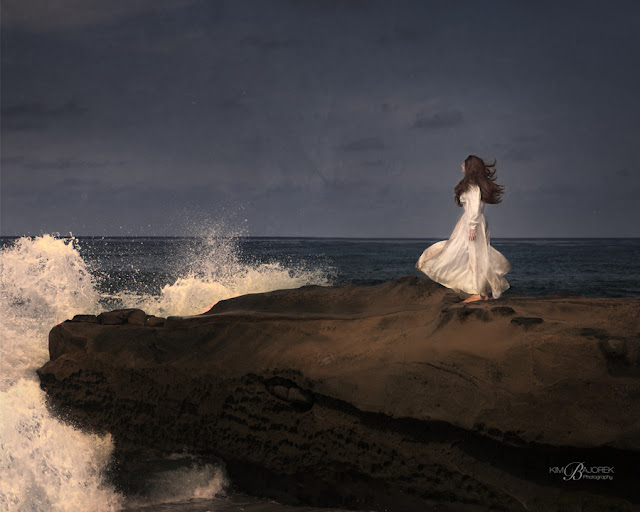
This image shows that although walking in the dark at the edge of the treacherous sea, on the back of what appears to be a giant creature is dangerous and frightening, it is actually a time of renewal--a time of rejuvenation. The white in her dress and the waves signify rebirth, as does the water. The breeze and the water add to the washing away of the old. The blessing is in the freedom, beauty and light that is there, even in the darkness.
First of all, it was a beautifully sunny day at my favorite beach, and all I knew initially was that I wanted this image to have an ethereal feel to it, with plenty of drama and movement.
Before - SOOC
So I put my camera on a tripod in order to take different shots of the waves hitting the rock and to capture the wind blowing her dress and hair. Using a tripod makes it easy to combine layers in photoshop. I had the model toss her hair around a bit, but the waves made the dress blow enough in each of the images. I think I may have used 4 or 5 images total -- some with crashing waves, and some with the dress and hair blowing in different directions. With each added layer, I created a mask, inverted it, and painted in the parts of dress, hair, or waves that weren't on the original layer. It's a good idea to zoom in after you've made changes to make sure you haven't painted away a hand or foot, or something else that will take away from the image you are imagining. I've learned this lesson the hard way! This step created the movement I desired.
Then I wanted drama, so If my memory serves me correctly, I desaturated the image a bit and then added some color back by using curves. I go into each channel individually (for color) in curves...either red, green or blue. In this case, I wanted a bit of red for her skin (after having it desaturated) so I pulled the red up in curves. I may have even selected her hands and feet specifically. I also typically like more gold overall, as I do like warm tones, so I went into the blue channel in curves and pulled the right side down (as yellow is the opposite of blue). Then I added some magenta by going into the green channel in curves and pulling the right side down a bit, because magenta is the opposite of green.
For more drama, I darkened the sky and most of the image. I selected the model with the quick selection tool, chose 'inverse' and then feathered my selection by about 10 pixels. Again I used curves and darkened my selection by pulling down from the center until it was to my liking. In the mask I may have painted some light back into the waves and different parts of the rock.
Always feather your selections so that the change in color, light, darkness, etc. is gradual. You can feather up to 250 pixels and you can even do it again to the same selection if you want more of a graduated effect. Of course in this case, because my selection was just the model, I only feathered by 10 or 12 pixels. I wanted her dress to glow to add to the ethereal effect, so I kept it the original brightness that the sun created for me.
Oh, and I almost forgot one important thing...I added a texture. I don't know which one, but I almost always use black and white textures and this is a black and white texture. I feel it gives more of a film effect and adds a bit more contrast. You can get many free textures from
Kim Klassen or from many different places on flickr.
I hope this helps!
I have a new blog in the works with a post of similar images I think you will enjoy. You can see it
here.


